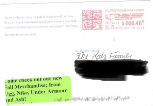
This post was inspired by a recent postcard mailing I received from Nordstrom a few weeks ago. See image below.
 Nordstrom is a very large marketer. Most of what I have seen would be considered good marketing which is why getting this postcard ruined my expectations and caused me to stop and evaluate the mailing.
In this post I’ll break down the postcard and identify some of the things which made me take a second look. In the next post, I will highlight additional tips and tactics to make your postcard mailings more successful.
- Mailed with full postage
- Handwritten address but generic card
- Wasted white space
- No branding on the address side
- Poorly printed green label added to card
- No compelling reason to respond or take action
1- Mailed with full postage
One of the main benefits of using a postcard in marketing is that they cost less to mail. However this card has a $0.46 meter mark. Sorry Nordstrom, you just overpaid for this mailing.
Since I am not privy to the marketing strategy that drove this mailing I won’t address the opportunity of presorting discounts but there was probably an opportunity to save even more.
2- Handwritten address but generic card
So if this was a local “mom & pop” business this wouldn’t be something I would worry about but Nordstrom can definitely afford and has the systems to coordinate a professionally produced mailing. I know some will say they are going for the “personalized look or feel”. If that is the case why is the card so generic and missing any personalization? This leads to the next point.
3- Wasted white space
What is going on with that 2-inch gap of space? If you are going to go through the trouble of hand addressing a postcard or using a “template” figure out something to put in the white space. When I saw the card I thought they missed something. If there is nothing else to add why not design the card with a different font size so the card is both easier to read and less sparse in appearance.
4- No branding on the address side
Call me crazy. Nordstrom has a great brand, however when I receive this postcard I had no idea who it was from. I can’t recall a postcard mailing I was involved with where we didn’t have the company’s logo or name on the address side of the card. The first thing a consumer sees in the mail is the address panel and the next thing we all do is look to see who the mailing is from. Basically, is the mail for me and do I want to open/read this or toss it?
5- Poorly printed green label added to card
This might be hard to see in the image but there is a green address label in the lower left corner. I understand that sometimes it is necessary to use labels on top of preprinted material. It is not ideal for sure. However, why green and why not make sure the text is readable? On this sample the text is cut off and looks unprofessional. We can, and someone from within Nordstrom probably should, discuss if this is ‘Brand Compliant’ but it definitely made me think twice about who this was from.
6 – No compelling reason to respond or take action
We can take apart the copy at some other point in time (maybe we will do that) but assuming I read the text what should I do? There is no offer or time sensitivity to take action. The reason to visit the store is generic and is not specific to me or the mailing. There is nothing special here. Oh wait, the new fall merchandise – could that be it? Pretty weak especially since the timing is too late for back to school shopping. If this card is a reminder then why don’t they say so?
OK so Nordstrom made some mistakes it happens. In my next post I will highlight some additional opportunities to use postcards more effectively in your marketing efforts.
If you have postcard marketing tips you would like to share please leave a comment below.
Related Post
Marketing with Postcards – the good, bad and ugly